How I Rebuilt 71 Web Tools in a Weekend — And Why I Had To
I redesigned 36 tools and built 35 new ones in a single weekend. 71 tools total. The before and after would have been perfect content, but I forgot to screenshot the old version before shipping. Classic. This is the story of why I tore everything down, what I rebuilt, and what happened after.
Why I Had to Rebuild
The old MZift Web Tools looked like 2020. And not the good parts of 2020. The design was dated, the layout was cluttered, and the mobile experience was an afterthought. SEO was actually working. Google was sending real traffic to the tools. But the UI was losing those visitors as fast as search was bringing them in. People would land on a tool, see an interface that did not inspire confidence, and bounce.
I could see it in the analytics. Traffic was growing, but engagement was flat. Time on site was low. Return visits were rare. The tools themselves worked fine, but the experience around them was pushing people away. There is a point where keeping a bad experience because "it works" is not really working. I hit that point.
What Changed
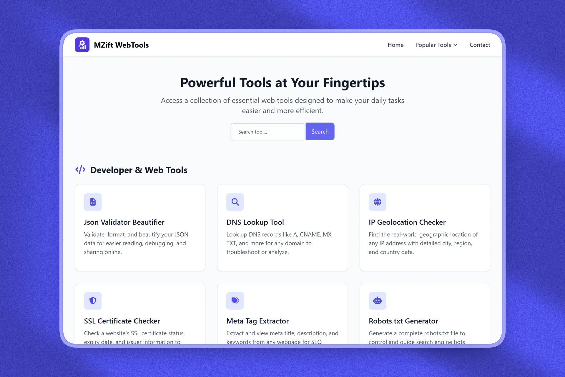
Everything. I did a complete UI/UX overhaul of all 36 existing tools. New layouts, new color system, consistent spacing and typography across every single tool. Each tool got a clean, focused interface with clear input and output areas. No clutter, no unnecessary elements, no visual noise.
Then I built 35 brand new tools on top of the redesign. The biggest addition was 31 image conversion tools covering every format combination between PNG, JPG, WEBP, BMP, ICO, and GIF. I also added an image optimizer, new calculators like the Starbucks calorie calculator and snow day predictor, and developer tools like a directory tree generator. Every new tool was built with the new design system from day one.
I added a search function so users could find tools instantly instead of scrolling through categories. Category organization got a complete rework with seven clear sections: Text Tools, Calculators, Dev Tools, Converters, Generators, Media Tools, and Image Tools. And every single tool was optimized for mobile.
The Risk
Here is the part that kept me up at night. MZift Web Tools already had over 1,750 existing users. Real people who used these tools regularly. A complete redesign meant every one of them would load the site and see something completely different. Some would love it. Some might hate it. Some might not find the tool they were looking for because the navigation changed.
But I made a decision: keeping a bad experience to avoid disrupting existing users is a trap. If the current design is actively losing new visitors, the cost of not redesigning is higher than the cost of change. You cannot grow by protecting something that is not working. So I shipped it.
The Technical Approach
Rebuilding 71 tools in a weekend sounds impossible, but the architecture made it manageable. Every tool in MZift Web Tools follows the same modular structure: PHP for the page framework and SEO, Tailwind CSS for the layout, and vanilla JavaScript for client-side processing. The design system is consistent, so once I nailed the new component patterns for input areas, output areas, and tool controls, applying them across all tools was systematic rather than creative.
The 35 new image tools followed a template pattern. Each converter has the same interface: upload area, format selection, quality controls, and download button. The underlying JavaScript handles format conversion entirely client-side using the Canvas API, which means user files never leave the browser. Building one converter well meant the other 30 were variations on the same pattern.
The search function was straightforward: a client-side filter that matches against tool names and descriptions. No server requests, instant results. Category organization was restructured in the config layer, so reordering or adding categories is a config change, not a code change.
The Results After 30 Days
The numbers tell the story. In the first 30 days after the redesign, MZift Web Tools had 1,784 visitors with an average session duration of 3 minutes and 32 seconds. For a utility tool site, that average duration is exceptional. People are not just landing and bouncing. They are using the tools, exploring other tools, and spending real time on the site.
Compare that to the pre-redesign experience where users were coming in from search and leaving almost immediately. The same SEO traffic is now converting into actual engaged users. The tools themselves did not change much functionally, but the experience around them changed everything.
What I Would Do Differently
Screenshot everything before you ship. I know this sounds obvious, but in the rush of a weekend rebuild, I completely forgot to capture the old design. The before and after comparison would have been incredible content for social media and this blog post. Instead, the old design is gone forever. Lesson learned.
I also would have staged the rollout if I had more time. Shipping 71 tools worth of changes all at once means if something breaks, it could be anywhere. I spent the week after launch fixing small issues that users reported: a converter that did not handle transparent PNGs correctly, a calculator that had a rounding error, a mobile layout that was slightly off on older iPhones. Incremental releases would have made debugging easier.
Lessons for Indie Makers
First, do not be afraid to rebuild. If your product is losing users because of design, no amount of new features will fix it. Sometimes you need to tear it down and start fresh. Second, consistent design systems save you. Having a repeatable component pattern meant 71 tools could be rebuilt in a weekend instead of a month.
Third, client-side processing is your friend. Every tool running in the browser means zero server costs for processing, complete user privacy, and instant results. Fourth, always measure before and after. I knew the old design was a problem because the analytics showed it. And I know the new design is working because the analytics confirm it: 1,784 visitors, 3 minutes and 32 seconds average duration.
If your product looks like 2020, it is time to rebuild. Your users will thank you. And screenshot the old version first.